In the art of small kitchen design, color is your most powerful tool for manipulating perception. The right **small kitchen color palettes** can dissolve boundaries, inviting light and creating the illusion of infinite space, while the wrong choices can make a room feel cramped and heavy.
I. The Power of Monochromatic Schemes
Using shades from the same color family creates a seamless flow that expands the perceived size of the room.
1. The Classic White Expansion
Pure white reflects the most light, pushing walls outwards. The secret is layering different textures (glossy tiles, matte cabinets, polished countertops) within the white palette to prevent the space from looking sterile.
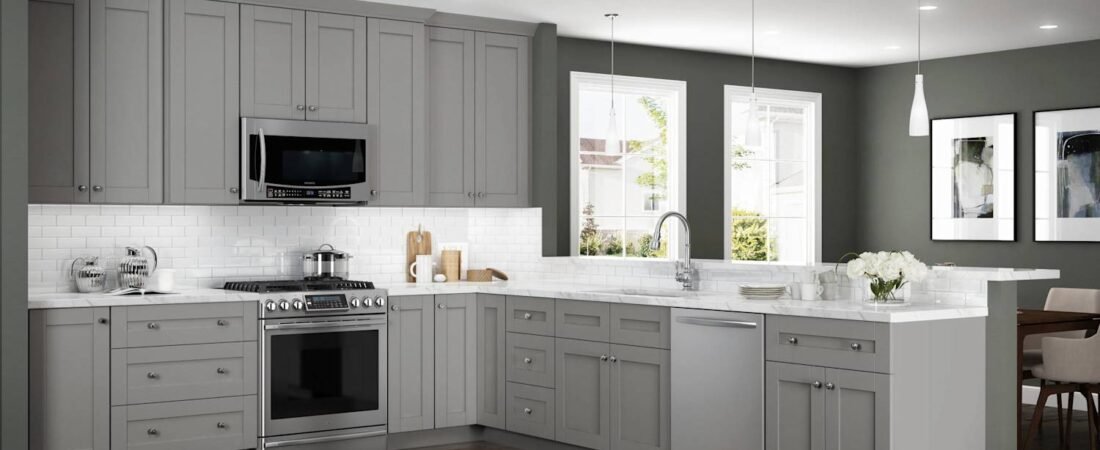
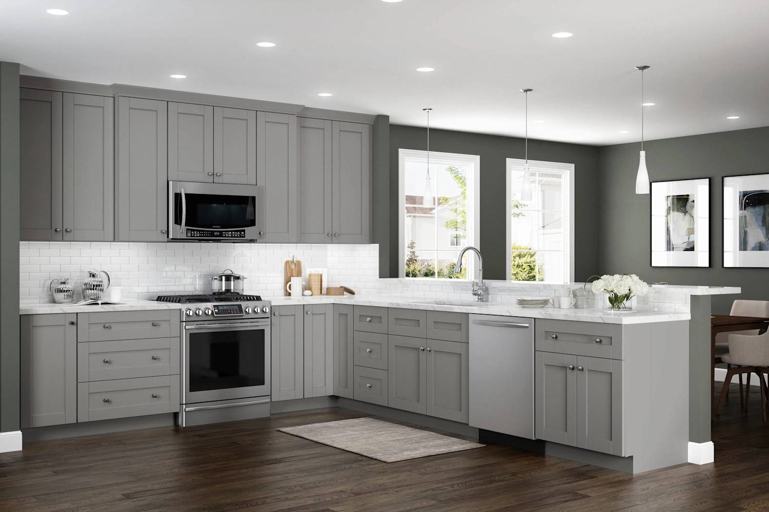
2. Soft Grays and Pastels
If pure white is too stark, opt for very light gray, pale blue, or mint green. These soft tones act like neutrals but add a gentle depth, preventing visual fatigue.
II. Strategic Use of Contrast and Light
To add personality without sacrificing space, contrast must be applied intelligently.
1. Grounding with Dark Accents
Use darker colors (like navy or deep charcoal) only on the bottom cabinets or the kitchen island. This grounds the space while keeping the expansive light colors at eye level, maintaining the feeling of height.
2. High-Gloss Finishes for Reflection
Cabinets or backsplashes with a high-gloss finish maximize light reflection. The mirror-like surface bounces light deep into the room, making it feel twice as bright and large.
Color is just one trick! Discover the full range of spatial illusions in our guide: Small Kitchen Design Hacks to Maximize Space.